9 Cheap (or Free) Data Visualization Tools That Don’t Require IT Support
A huge challenge for nonprofits is often taking the next step from having data to using data.
It’s often relatively simple to collect row upon row of records and store them somewhere. But, to what end? Data is hugely powerful and can help you improve or transform your organization–as long as it’s useful and usable data.
Sometimes you just have to see it to understand it.
In many cases, that’s how data is best used. In a flat spreadsheet or collected in a database, your data has the same amount of information. But it’s not until you transform it into something visual–a chart, a graph, or even just a summary table–that you gain enough insight to make it actionable.
But technology also presents another barrier for NPOs. Many of the best data visualization and management tools require you to already have a deep technology knowledge or skillset.
To help your organization start actually using your data, one of the quickest, most powerful strategies is to have the right, self-serve tools in place to do something with that data after it’s collected. Luckily, there are many options out there that can help you put your data points to good use.
Here are 9 no- or low-cost tools you can use to manage and visualize your data without relying on technical or IT support.
1. Tableau Public
Tableau is one of the best data tools on the market–and its public version is free. The only catch is that you’ll have to publish the data analysis publicly on the web, so it’s obviously not a great solution for personal data or anything you want to keep secret.
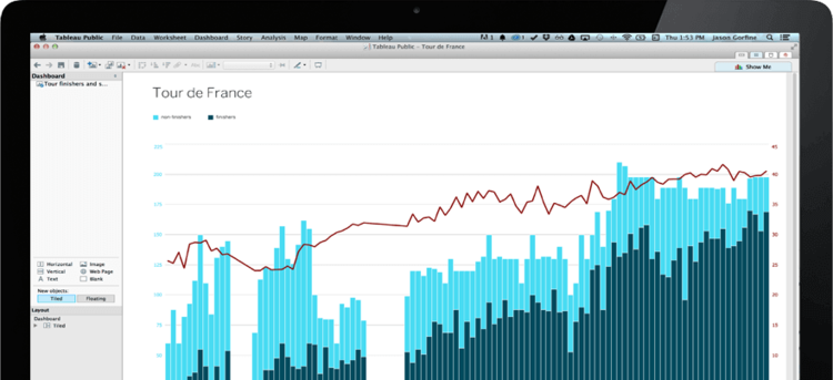
Source: Public.tableau.com
However, if you want a robust, free way to publicly share the impact of your programs, strengthen your grant writing with data, or share your financial information with supporters, Tableau is an option worth considering.
And even if you need to visualize private data, you can apply for a free version of Tableau Desktop through the Tableau Foundation.
Either way, with Tableau, you can crunch seriously big data sets and create complex and powerful data visualizations that expose new insights and provide a rich view of your organization and its data.
While you don’t have to know how to write code or build any special tools to use Tableau, there is a pretty steep learning curve. Because it’s so powerful, it’s also pretty complex. But once you master the interface and the basics, you’ll be able to analyze data and create insightful visualizations.
2. Infogr.am
If you want to create dead-simple charts, graphs, and maps to embed on your website or include in blog posts, then Infogr.am is a perfect option. With this tool, you can copy and paste data directly from a database or spreadsheet, select a few options, and have an interactive data visualization in minutes.
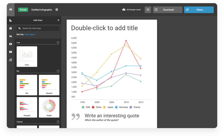
Source: Infogr.am
While Infogr.am has a fee starting at $19/mo, it also offers special education and nonprofit pricing, so make sure to apply for the discount before you sign up.
With this level of simplicity, of course, comes some drawbacks. Infogr.am is great for simple charts and graphs but isn’t the best option for very complex data. It also doesn’t have any sophisticated analysis tools, so be prepared to put in the exact data that you want to use to generate your desired visualization.
3. DataHero
This tool works both with raw data in spreadsheets and by integrating with third-party data sources. This makes it incredibly powerful and simplifies much of the process of compiling, cleaning, and uploading your data from various places.
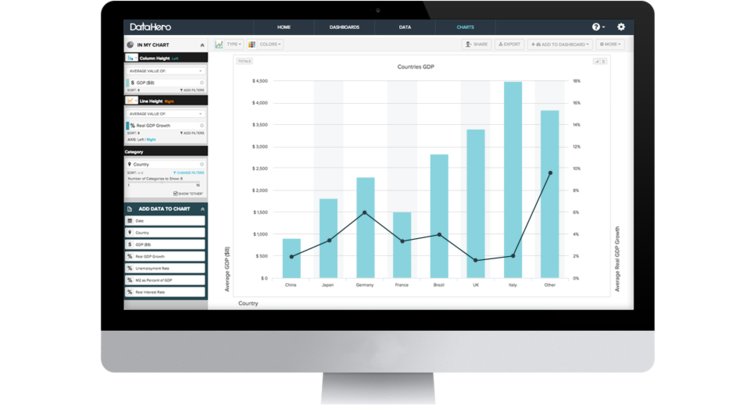
Source: Datahero.com
DataHero provides a super simple system to help you create charts and graphs in a drag-and-drop fashion, too.
In particular, nonprofits will like the Salesforce and MailChimp connectors, which allow you to automatically import your data and run reports against it with no manual exports or custom programming needed.
DataHero offers a limited free plan, too, so you can test how it works with your data before committing to a paid plan. (Or you can just stick with free plan as long as you like!)
4. Microsoft Power BI
Microsoft Power BI (which stands for business intelligence) is like the 5,000-pound gorilla of the data analysis space. It’s great for crunching big numbers related to business functions, customers/donors, financial records, and more.
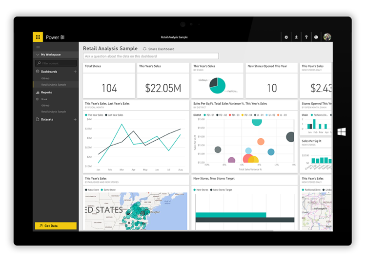
Source: Powerbi.microsoft.com
It brings much of the functionality of all of these other tools under one roof–including data integration, powerful analysis, visualizations, and more. But that also means it’s a bit more complex and can be difficult to use without a strong technical background.
Even so, with the right setup, Microsoft Power BI can connect your entire organization and meet just about any need you throw at it. Plus, not only does it have a free offering, but the paid version is only $10 per user per month–it’s actually quite affordable.
5. Openheatmap
If you have a location-based data set and want to visualize that data, this tool is the perfect solution.
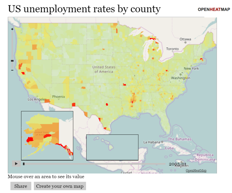
Simply upload an Excel sheet or Google Sheets document and Openheatmap will let you turn it into a map-based data visualization showing density, popularity, differences, and other metrics across a given set of locations.
It works for analyzing specific cities, states, counties, or countries. It’s also very straightforward and easy to use, even for non-techies.
Oh, and did we mention it’s free?
6. Weave
Weave is a bit more complex, but also incredibly powerful. This tool is built to integrate with your third-party applications and create mixed visualizations from data across multiple sources.
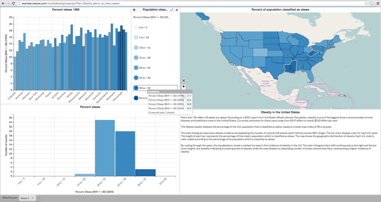
Source: iweave.com
It’s also open source, which means it’s free and can be customized and extended to fit almost any need for your nonprofit. This makes it especially powerful for integrating multiple systems or creating data dashboards using data from multiple sources.
You’ll probably need IT/consulting help to set up Weave. However, once it’s up and running, you should be able to build dashboards and visualizations on your own.
7. Chartbuilder
Chartbuilder isn’t the simplest or most sophisticated tool on the planet, but if you have a heap of data that you want to turn into a chart or graph, it can get the job done. Basically, you just copy and paste your data into the tool and export out a static image of the chart you create.
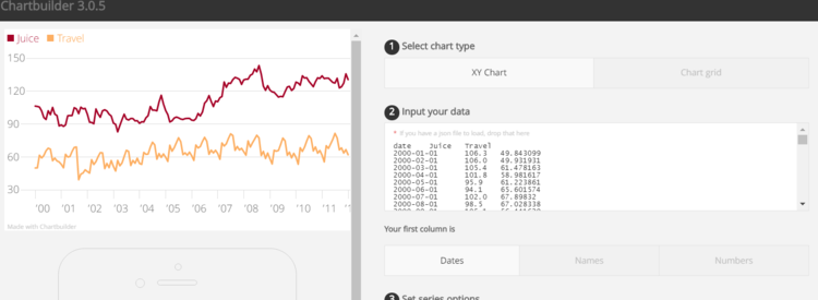
It takes just a few seconds, has a few options for configurations, and is a simple way to generate a decent-looking visual from a bunch of numbers in a spreadsheet.
8. Metabase
Metabase is a perfect open-source solution for nonprofits that have a lot of data and multiple people who use it in different ways.
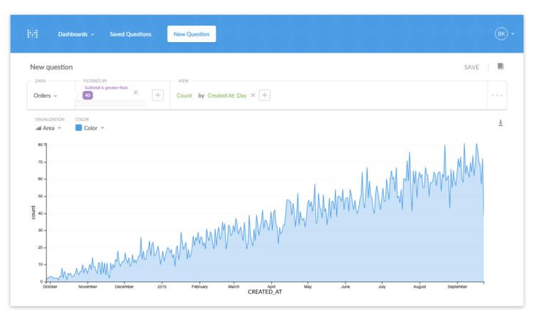
Source: Metabase.com/docs
It allows you to generate reports and dashboards from your raw data (e.g. a database server that stores your website or CRM data) without the help of a consultant or IT professional. And it’s designed to be dead-simple to use, even for non-techies.
This tool is best used as a multi-purpose data analysis interface rather than for creating really fancy or interactive data visualizations. But it can give your organization way more command over its data and allow staff members to answer questions for themselves without needing any outside help.
9. Zoho Reports
Zoho’s wheelhouse is business data and Zoho Reports is no different.
This tool is great for tracking pipelines, cashflow, donor data, and other business intelligence-level information. It teases out insights that can help you steer your organization toward a more secure future or capitalize on unrealized opportunities.
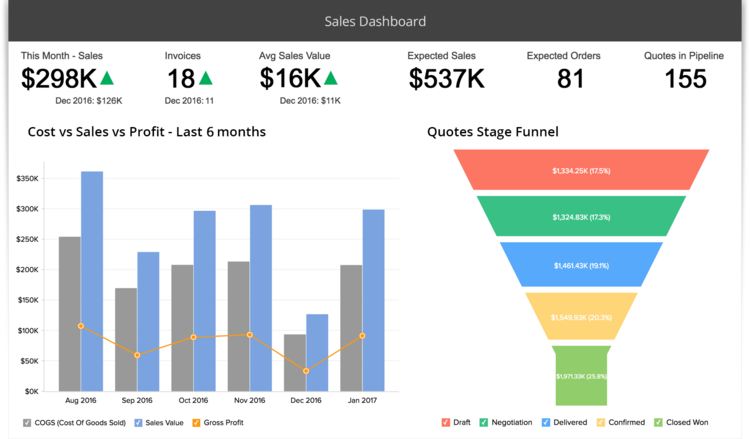
Source: Zoho.com/reports
It also offers a free plan for up to 2 users, and its paid plans are competitively priced compared to other business intelligence solutions.
Wrapping up
Each of these tools offers a slightly different set of functionality and specialization. For most organizations, having the right tool to manage and analyze data is the first step toward embracing data as a way to change and improve your outcomes.
Even without taking huge steps, being able to better visualize and analyze the data you already have can reveal practical ways for you to improve your programs, engage your supporters, and identify hidden issues in your organization.