Are Your Supporters Confused by Your Website?
One advantage of working with nonprofits over the years is you start to see problems that are repeated across organizations.
For example, I bet you’ve wondered more than once if your website is confusing or turning away visitors because they don’t understand (or can’t find) the information they need.
Let me ask you a question in response: how well do you really understand your audience? (Because if you truly understood them, chances are you wouldn’t be asking that question.)
You live in a fishbowl
If you work at a nonprofit, you live in a fishbowl every day. You see your organization from inside the glass. Your audience is looking in from the outside.
And while you are describing the inside of your fishbowl as you see it, your audience is seeing an entirely different murky, distorted version from the outside.
When it comes to your website, I often find organizations are unable to separate how they see themselves from how their constituents see them. This translates to a website structure and language that mirrors the org chart, program structure, and vocabulary that staff members use internally.
The problem is, to an average person, this can be confusing unless they are familiar with your work or type of organization. It leads to an unfortunate event where a person leaves your site because they don’t identify with what they see.
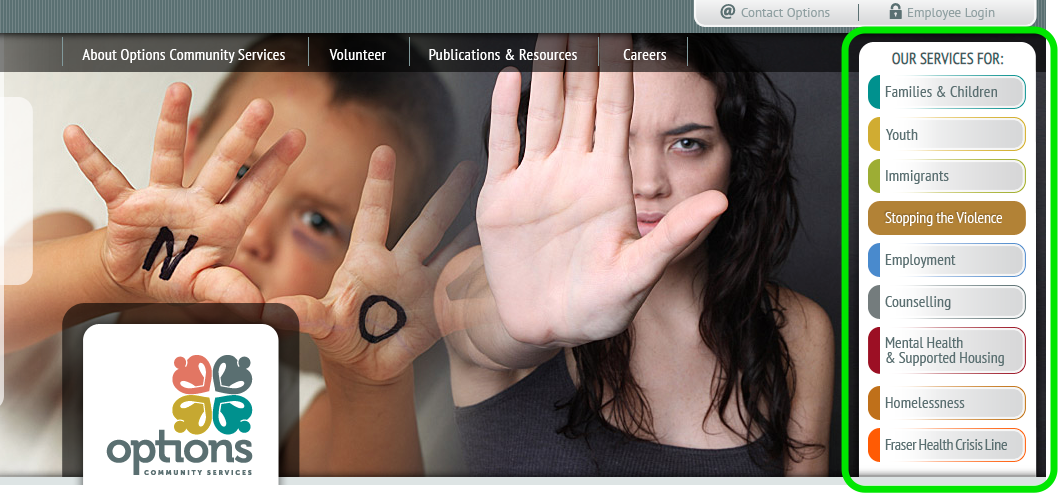
Let’s look at a practical example. I hate to pick on anyone so I’m going to use the “before” website from one of our clients, Options Community Services. Here’s how their site was organized previously (note the navigation circled in green):

These are logical categories for programs, but it’s not immediately obvious to someone searching for affordable housing to click on “Homelessness” unless they are actually homeless. And many folks searching for affordable housing will not be—at least not yet.
The challenge for this social service agency is they have dozens of programs, and it’s difficult to communicate all of them in the absence of how the organization groups them internally.
In other words, they know they live in a fishbowl, but they can’t get out.
But you get this already. It’s been my observation after working with numerous organizations that internal staff are usually aware of their limited perspective, but they’re way to close to the organization to see it any other way.
Which begs the question—how do you fix it?
Getting out of the fishbowl
Let’s get the answer out of the way so I don’t leave you floundering (har har):
You get out of the fishbowl by developing a better understanding of your constituents and how they see your organization through the process of research and discussions that lead to user personas.
You may have heard about user personas before. But if you haven’t, user personas are fictional representations of your major audience groups. They give you convenient “glasses” you can quickly put on to evaluate your communications strategy from an outside perspective.
The process of developing personas is an art in itself, but for nonprofits, you may see groups of personas such as:
- Program participants, volunteers, and professional referrers (social service agency)
- Patients and professional members (medical association)
- Job seekers and job posters (employment services)
Personas will vary depending on the organization, but it usually isn’t difficult to unearth your major audiences after a conversation or two.
The challenge comes in looking at the data and having conversations with each of those audiences to understand their needs and challenges with your website. This is the activity that will start to get you out of your head and into the head of your constituents.
At the end of the process, your personas contain a summary of all your discussions and research to serve as a point of reference as you reorganize and rewrite your website content.
In the case of Options Community Services, they now group their programs by identifiable needs (e.g. “Finding Housing”):

Of course, user personas are not going to put words on the page for you, but they will help you break out of the mental prison you get trapped in when you work somewhere day in and day out, and struggle to describe what you do to a newcomer.
So, if you have that nagging feeling that your website might not be “getting the message across” to your visitors, user personas may be just the tool you need to break out of the fishbowl and start engaging people using their language—not yours.


