Time in Range Coalition
A new website for the Time in Range Coalition that provides life-changing information about managing and living with diabetes for people with diabetes and healthcare professionals.
Overview
The team at Brooks Digital leveraged the Time in Range Coalition’s new branding materials while researching and assessing site visitor needs to strategize, design, and build a website for the organization.
The goal was to clearly and easily share information, resources, and research materials with people with diabetes, healthcare professionals, and industry partners in a manner that is easy to digest and welcoming to all types of site visitors.
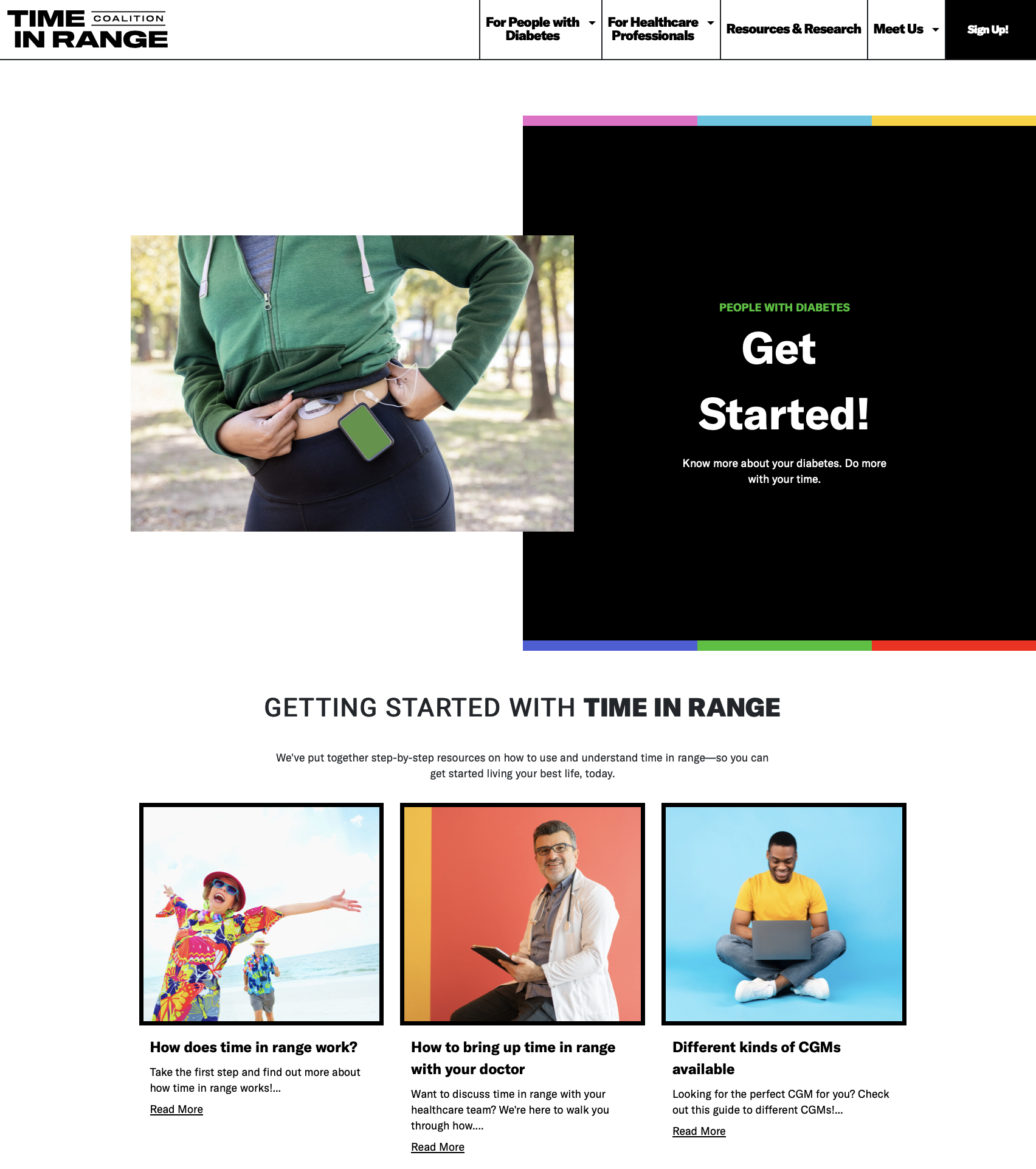
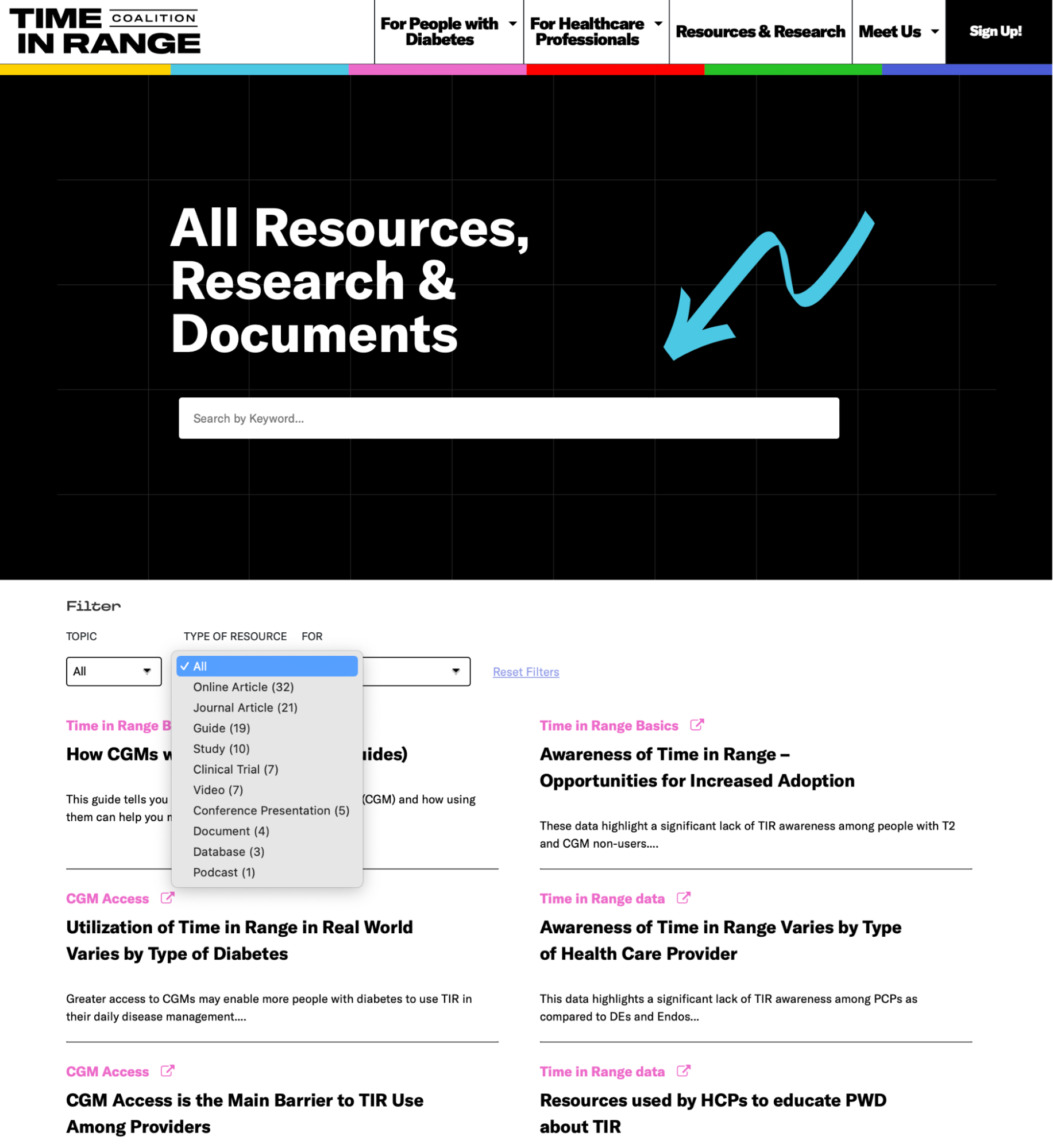
The new website provides foundational information and testimonials for people with diabetes, education and the latest research for healthcare professionals, and a resource page for easy searching of materials based on topics, site visitors, and resource type.
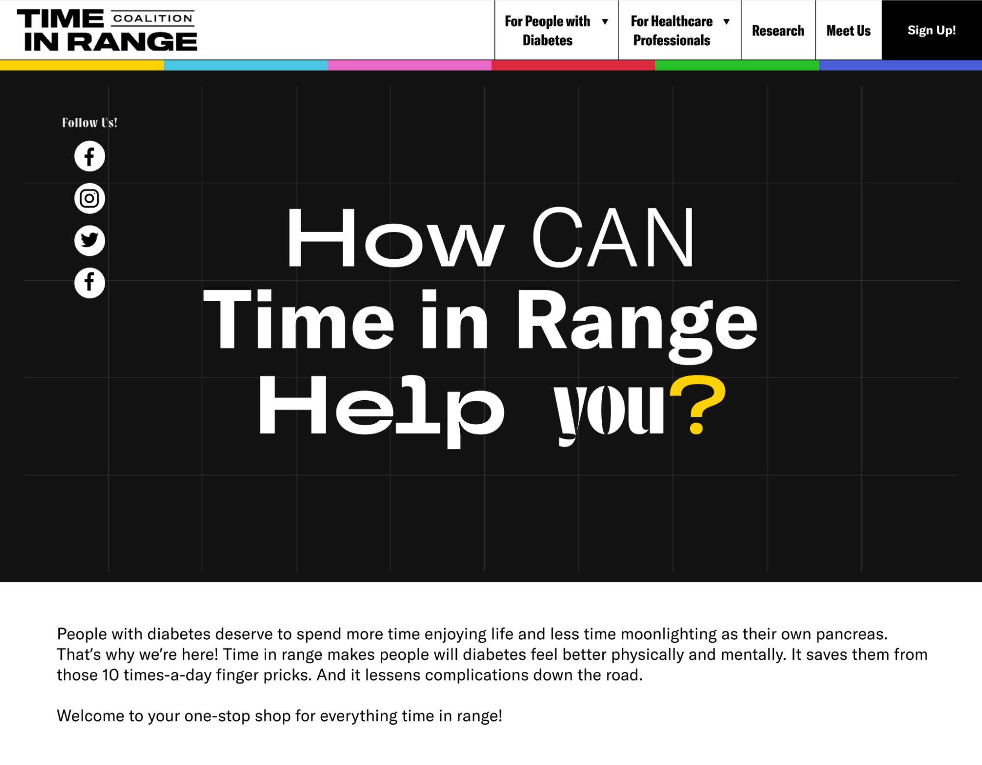
It uses the established brand identity, a bright color palette alongside large black-and-white fields, and an image library to produce a website that focuses on inclusivity.
Built using a customized WordPress installation, the site uses an intuitive interface for authoring and content additions. Following the site build, site authors participated in a training session. A new user guide and continued support ensure a secure and successful site.
About the Client
The Time in Range Coalition comprises people with diabetes, researchers, leaders from diabetes-focused organizations, and industry partners in the medical and pharmaceutical industries who share an interest in providing potentially life-changing information about living with diabetes. Their goal is to make time in range, complemented by A1c, a metric for diabetes health globally.
Goals
The primary project goal was to create an easy-to-use and engaging website to inform people with diabetes about time in range (TIR), alleviate their fears, provide guidance, and answer questions on maintaining healthy lifestyles alongside balancing their glucose levels.
The site also needed to provide information about TIR that healthcare professionals can share with their patients. Finally, the Coalition’s overarching goal to make continual glucose monitors (CGMs) more affordable and available to a larger group of individuals, thus reducing the burden on healthcare systems from patients adversely affected by diabetes complications, needed to be addressed.
This new website design and build needed to incorporate the third-party branding, identity, and style of messaging designed for and approved by the Coalition, accommodate additional information and functionality as it becomes available, and be easily maintained by the client.
Methodology
The Brooks Digital team followed a systematic approach to project execution that included the following:
- Brand analysis and design recommendations that adapt the brand guidelines for an online experience
- Content mapping, analysis, and information architecture recommendations
- Wireframing
- Visual and interface design
- Custom website development and programming
- Site building
- Documentation and training
- Quality Assurance
- Post-launch support and continuous improvement
Solution
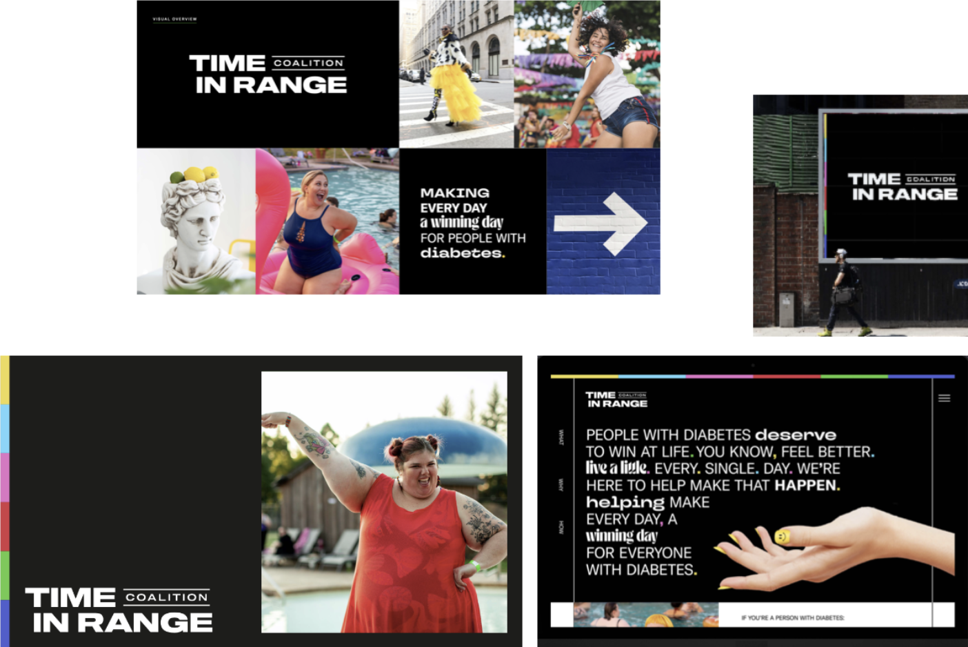
The Brooks Digital design and strategy team delved deeply into the third-party brand and messaging materials the client provided. The team wanted to ensure brand continuity, with all materials using the same look and feel regardless of their delivery method.
The analysis quickly followed with a stakeholder workshop that included in-depth discussions to fully understand this project’s distinct needs, subject matter, business requirements, and corresponding user groups.
Read more
We determined that site visitors typically include:
- People with diabetes
- Healthcare professionals
- The Coalition and other global advocates for making continuous glucose monitors affordable and accessible to their communities
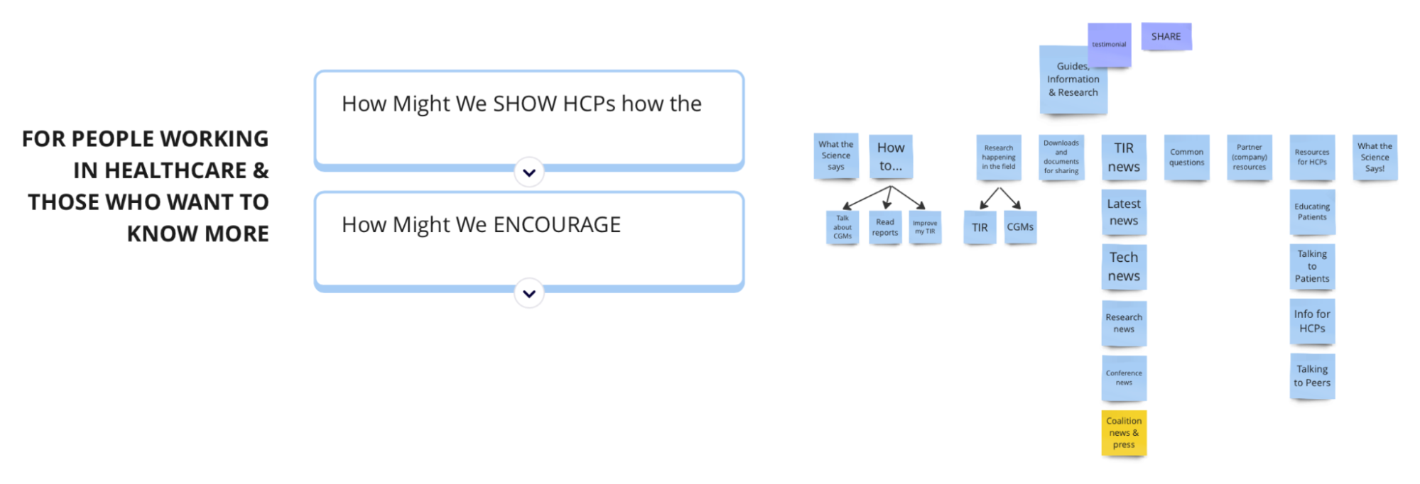
Brainstorming content solutions and defining site architecture were enabled by performing a “how might we” needs analysis exercise for each user group. This is where we discovered shared and distinct content.
By understanding the siloed interests of future site visitors and their possible searches, we divided the site into four main sections for information focused on:
- People with Diabetes
- Healthcare Professionals
- Resources & Research
- The Coalition
The “For People with Diabetes” and “For Healthcare Professionals” sections contain curated articles and general information to aid site visitors’ journeys. The “Resources & Research” section allows users to search the site based on topic, type of resource, keyword (taxonomy), and user type. The “Meet Us” section provides easy access to information for those interested in the work and initiatives of the Coalition.
The site uses strong imagery, a bright color palette, strong contrast, and light-hearted messaging to create an inclusive and engaging visual design. The use of various fonts echoes the Coalition’s print and identity campaign.
Built on WordPress using Understrap, a code-first, mobile-first framework built off of Underscore and a product of the company that built WordPress, Automattic, the custom theme is stable and efficient. It extensively leverages server-side rendering and caching for a fast website with low bandwidth, latency, and client-side overhead. Developers, administrators, and site visitors enjoy its consistency, speed, and efficiency.
Providing training and creating a User Guide wrapped up our deliverables and ensured success for the client as they entered content and built out the site.
Following the site launch, we continue to add functionality, make incremental improvements, and provide security updates and support.
Design
The new site uses black-and-white backgrounds and fonts. Six highlight colors provide some levity and distinction to labels on the site.
Bright, inspiring, inclusive photographs set an uplifting tone to the web pages. Reduced font styles from the large number provided by the client simplified the look and feel.
Some custom illustrative touches added to select pages provide additional interest.
Challenges
As with any new site build, multiple stakeholders, and a tight timeline, the “Time in Range” website had challenges.
Gathering and incorporating feedback from the Coalition Steering Committee is a great example. Our typical recommendation for projects is to provide all content and design feedback early in the project, during the design phase. This way, we can alleviate any last-minute hiccups and rework of approved deliverables.
Read more
After design approval, the client elected to engage the Steering Committee to solicit their feedback on an interactive version of the site with the final content. Because the approval meeting with the committee was deep into the development phase, our team created an interactive prototype of the site in Figma so the client could present it to the Steering Committee.
While the committee ultimately provided feedback that required our team to rework previously approved areas of the design, our designer and programmer quickly and effectively made the changes.
Brooks Digital exceeded all expectations with this project. With an exciting, bold design and user experience that speaks to our mission and invites users to explore, they were able to create our online dream home for Time in Range.
Results
The new Time in Range Website provides a welcoming, compelling, and professional source of information for people living with diabetes and healthcare professionals. It offers quick and easy access to content based on the type of site visitor.
The bright and fun imagery supports the goal of making the subject inclusive and accessible to all. The site structure clearly responds to the needs of the different site visitors.
A simple WordPress authoring environment, combined with training, ensures the client’s independence and authority to add and edit content as it becomes available.
Continued support and maintenance ensure site security and additional functionality post-launch.
Interested in working with us?
Let’s create something impactful together. Reach out to get started.

