Case Study
diaTribe Learn
Key Facts
-
diaTribe Learn is the flagship resource of The diaTribe Foundation, a nonprofit whose mission is to improve the lives of people with diabetes.
-
The website has more than 3 million annual visitors and 250,000 email subscribers. It provides the latest news and resources to help people with diabetes improve their quality of life.
-
They have a dedicated editorial staff of 5 that publishes new content on a regular basis.
Outcomes
diaTribe originally engaged us to make technical and design updates to their Drupal site. However, our work uncovered some underlying issues that needed to be addressed first.
Here’s how we helped:
1. Identified information architecture issues
Early in our work together, it became clear there were a number of issues with how the diaTribe Learn content was organized.
The site evolved from an online magazine-based format in which it was organized into monthly issues with recurring columns. Over time, it transitioned to a blog-based format continuously updated with the latest news.
However, the site was still organized around these different columns with names such as “new now next” or “learning curve,” which were foreign to most readers.
diaTribe Learn also had a deep catalog of thousands of articles, but the information architecture of the site only exposed the latest 6 months of content.
We recommended that diaTribe pause its technical and design updates to first focus on improving its information architecture.
2. Delivered research-based insights
To solve this challenge, we performed in-depth research on how people with diabetes used the internet to manage their health.
We uncovered a few key insights from this research:
-
People with diabetes often have to “filter out the noise” from content that is not relevant to their type (type 1 diabetes has different considerations than type 2 diabetes).
-
People with diabetes encounter new scenarios daily and find the process of search for answers difficult and time-consuming.
-
The most painful and confusing point in the journey of someone with diabetes is when they’re newly diagnosed. There is an overwhelming amount of information to process.
-
People with diabetes struggle to identify which websites they can trust.
-
People with diabetes feel alone and want to connect with others who share the same condition.
These insights helped us recommend a few ways to improve the organization of diaTribe Learn’s content.
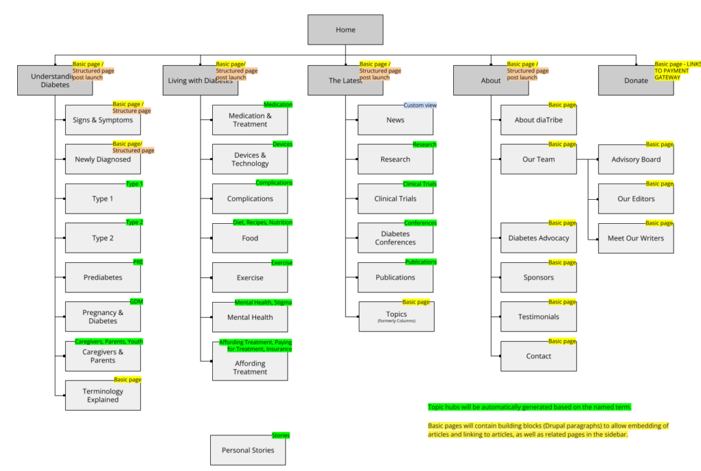
3. Re-organized site content to address audience pain points
We recommended and implemented a number of changes on diaTribe Learn as a result. A few highlights:
-
-
Added a prominent “Newly Diagnosed” section to diaTribe Learn, providing a structured learning path for those newly diagnosed.
-
Helped the editorial team audit and re-tag its entire back catalog of content to assign the proper topic(s) and diabetes type.
-
Developed an entirely new primary navigation for the website:

Interested in working with Brooks Digital?
Fill out the form below to get in touch with us. We look forward to hearing from you!
