dStigmatize
A redesign, restructuring, and upgrade of dStigmatize.org to improve the needs of the site visitors and authors and create a robust resource library to assist healthcare professionals in discovering information about diabetes stigma quickly.
Overview
The dStigmatize.org website improvement project is an extension of the work completed by Brooks Digital in February 2022, when we launched the first iteration of a website that addresses some of the issues surrounding diabetes stigma.
The two primary goals and deliverables for the project included:
- Update the user experience to target a new audience for those working in healthcare while upgrading the brand, design, and authoring methods
- Create a new “Toolkit” or “Resource Library” that is easy to find, use, search, and filter.
Following a detailed discovery phase, the BD recommended a modified site navigation, relocating some site content, creating new page layouts, and implementing the Gutenberg editor to allow the client to create compelling and flexible pages in the future.
Along with the sitewide improvements, we created and assisted in building the “Resource Library,” including content pages to give site visitors a streamlined and improved experience to learn and share information about diabetes and stigma.
The updated site is more engaging, better reflects the diaTribe brand, and encourages site visitors to visit more pages and stay on the site longer.
About the Client
diaTribe aims to reduce the impact of diabetes on society and improve the lives of people with diabetes by fostering an understanding of the disease, eliminating misplaced blame, and ensuring access to care. dStigmatize.org is one of diaTribe’s secondary sites targeting important topics related to the disease, specifically the stigma associated with a diabetes diagnosis.
Goals
Where the first iteration of the dStigmatize website was designed for communicators and people with diabetes, our investigation showed that advocacy groups were increasingly important site visitors, and healthcare professionals became the primary audience.
This information, along with the client’s experience using the site, gave us ample information to define the two main goals and deliverables clearly.
- Make general site improvements to increase engagement, upgrade the branding and visual design, improve user flows, and create a better overall experience for site visitors and authors.
- Create and build a Resource Library or “Toolkit” that provides site visitors with a streamlined, informative, and powerful method for locating resources to help them understand, reduce, and provide guidance about the effects of stigma. The Resource Library landing page needed to be friendly and informative for digesting and scanning content. The content pages needed to be simple to configure with the ability to add visuals easily, format, add functionality, and share.
Methodology
The design and technical teams at Brooks Digital reviewed the requirements and the legacy site to determine the best plan of action. Along with the Project Manager, they agreed that a phased approach to the development and launch would benefit the client’s workload, clearly meet their external deadlines, and allow dedicated time for content entry while the BD team focused on the second key deliverable.
The Brooks Digital design team began by performing an in-depth analysis of the previous dStigmatize.org site before setting to work on design and usability tasks. The technical team began by evaluating the legacy site and the value of adding the Gutenberg editor for the authors.
Our methodology includes the following tasks:
- Infrastructure and technical planning
- Client needs, user experience, and technical survey
- Content mapping, analysis, and information architecture planning and recommendations
- Wireframing the homepage, landing pages, and general content page
- Brand analysis and benchmarking
- Graphic and interface design
- Content creation (graphics and principle messaging)
- Custom website development and programming
- Retheming
- Gutenberg editor integration and site enhancements
- Accessibility, GDPR compliance, and tracking tasks
- Site building and content entry
- Documentation and training
- QA and launch
- Post-launch support and continuous improvement
Solution
Step 1: General site improvements
With the first phase of the site launched in February 2022, diaTribe felt it was time to thoroughly audit the dStigmatize website to assess what improvements and functionalities should be made.
Following our discovery exercises, site analysis (for content and functionality), client questionnaire, and documentation, we identified three areas for improvement.
Read more
- Specific types of content were difficult to quickly find and differentiate for the three categories of site visitors.
- The information architecture now needed to prioritize healthcare professionals.
- Pages had become text-heavy, and visuals were not used consistently to their advantage. Basic components such as accordions were underutilized, making the pages difficult to digest.
Using our content mapping techniques, our strategist evaluated and categorized each piece of content. We discovered that some general information on landing pages would best be relocated to the “Resource Libary” and that many landing pages were complex, with too much information, text-heavy pages, and places where the content blended. Readability was a concern.
We redesigned each landing page to better reflect its purpose and modified the top-level navigation to ensure that the new “Resource Libary” would be quick and easy to find. We also created and suggested new content pages where necessary.
The overall design was improved, and this initiative’s relationship with its parent diaTribe organization is now evident. White space, a streamlined color palette, and more compelling site visitor interactions improve the site’s usability.
In the backend, our developer installed the Gutenberg editor to provide the required flexibility for the pages and client and coded the general design improvements.
The backend work was followed bysite and page building, and general support tasks documentation, to ensure a successful relaunch and a happy, self-sufficient client. We continue to provide support post-launch, adding functionality, making incremental improvements, and performing security updates.
Step 2: Creation of a “Resource Library” or “Toolkit”
During our first discussions with the client, they mentioned they were impressed with the “Resources & Research” page we created for the “Time in Range” website. They saw the value of that solution and asked us to create a similar solution but one that reflected their needs and site visitors. The goal for their Toolkit was to create a quick, helpful, and informative repository of information to help their audiences understand, reduce, and provide guidance about the effects of stigma on their patients.
Read more
During our first discussions with the client, they talked about how they were impressed with the “Resources & Research” page we created for their sister organization’s “Time in Range” website. They saw the value of that solution and asked us to create a similar solution but one that reflected their needs and site visitors. The goal for their Toolkit was to create a quick, helpful, and informative repository of information to help their audiences understand, reduce, and provide guidance about the effects of stigma on their patients.
The toolkit needed to be prioritized in the top-level navigation to quickly and easily access its functionality and content. It also needed:
- Solid search capabilities
- Advanced filtering
- A friendly and informative method for digesting and scanning content
- New, easy-to-configure content pages with the ability to add visuals easily, format, add functionality, and share
In collaboration with the client, we categorized the types of content in the Toolkit to include guides & tools, videos, research, partner resources, personal stories, press releases, and other potential resource types. Much of the legacy content comprises PDF documents and short external YouTube or Vimeo-hosted videos run on the site.
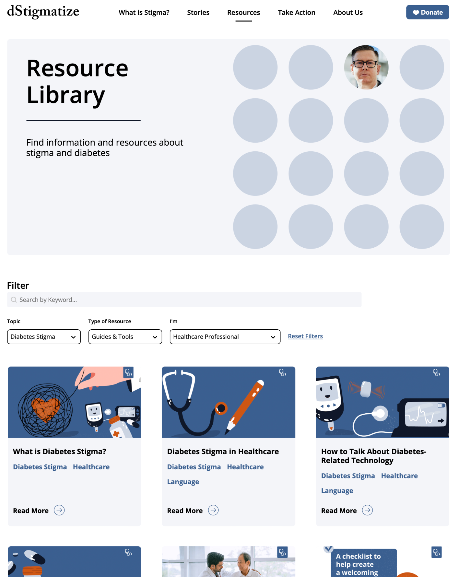
The toolkit, which can be accessed quickly through the “Resources” link on the site-wide navigation, provides a smooth and powerful user experience. Entering the topic in the keyword search delivers solid search capabilities.
Advanced filtering for Topic, Type of Resource, and type of website visitor streamlines the results. Large graphic “cards” engage site visitors by displaying an image, title, and tags reflecting the topics that apply to the resource. A “Read More” button allows quick access to the content page. A stethoscope icon on the card and the content page indicates pages intended for healthcare professionals.
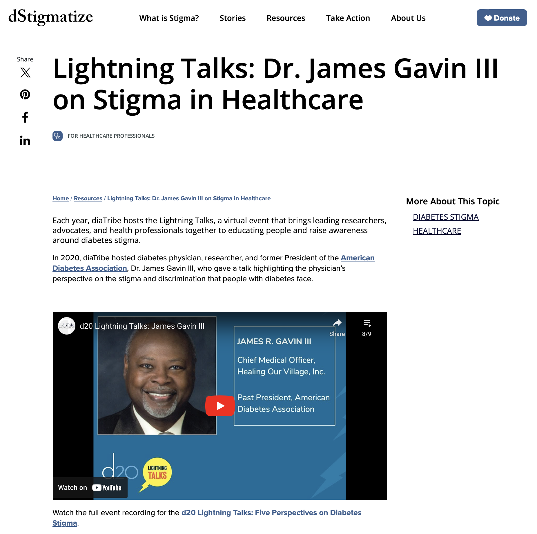
As SEO is an ongoing concern at diaTribe, materials containing content that cannot be easily scanned and indexed by search engines, such as videos and infographics, now have a dedicated page for indexing. These pages include a summary of the document or video, an identifiable image, and a link for downloading the full PDF document or viewing the video. The pages have improved and increased visuals, format, functionality and ability to ease of sharing.
Design
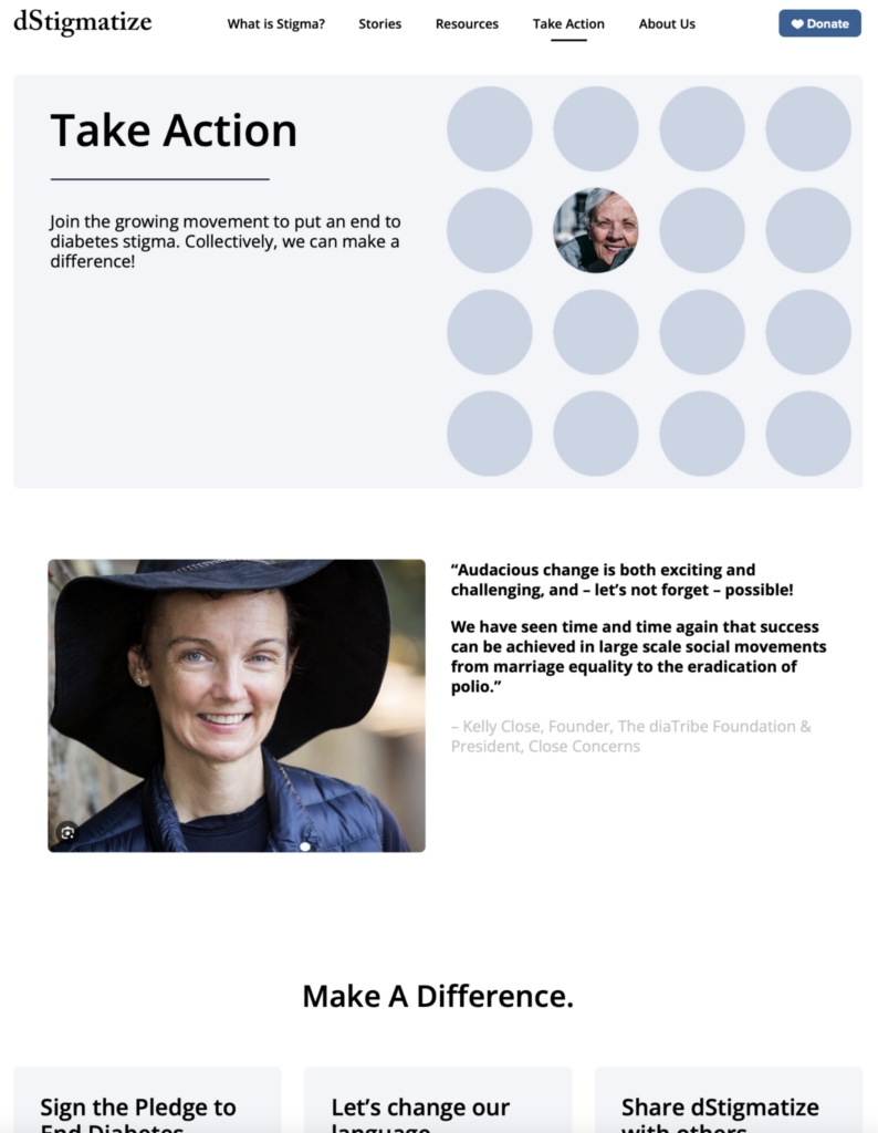
The redesigned site leverages and improves the work completed on the legacy site and ensures the diaTribe brand is respected. The new design simplifies pages, improves engagement, emphasizes calls to action, and makes it easier for site visitors to read, understand, and take action. A redefined site architecture ensures that healthcare professionals can quickly access their information.
The pages use various predetermined components, some with rich images, and ample white space to help segment the information, thereby improving page readability. A refined palette of cool blue tones ensures that the rich imagery and graphics “pop” visually, giving the site much-needed contrast. Buttons are now more interactive, and linked text is used less.
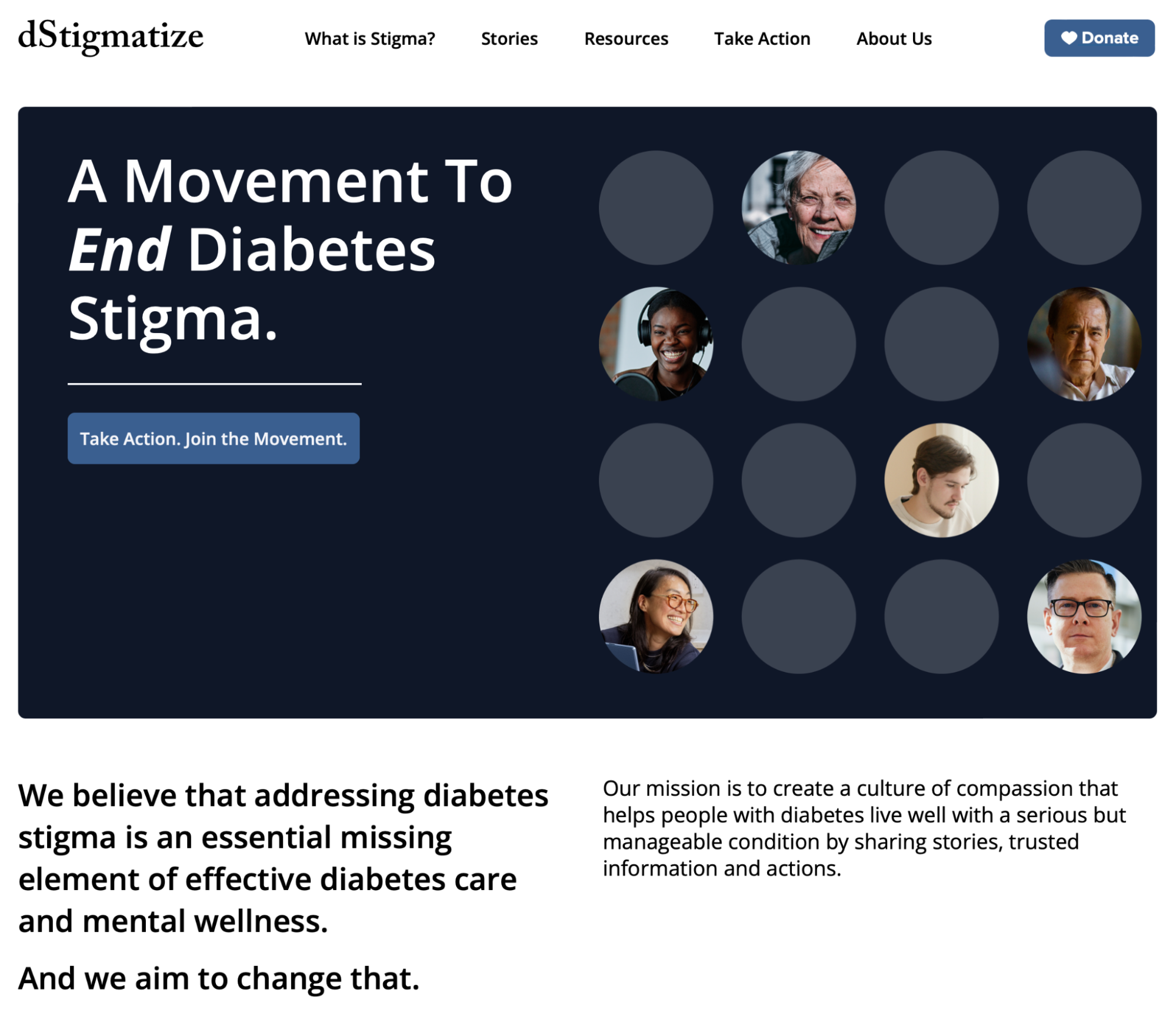
The bold graphic design for the hero images incorporates circular cutouts, some housing images of individual people, representing the loneliness that can result from stigma. The footer, which largely leverages the footer design on the new diatribe.org website, is an homage to the diaTribe brand.
Challenges
The legacy site was configured so that each page used fixed fields for authors to fill in with either text or an image. The new dStigmatize.org introduced the client to the Gutenberg editor — allowing authors to configure pages using a list of standard components, and then arranging them into their preferred order. After setting up their pages, authors add appropriate content, save it as a draft, and review the page before publishing.
This new approach required training and, at times, assistance from Brooks Digital to create the initial layouts that best express the page content in a web-friendly manner. As the client’s skill set focuses on writing and research, it was understandable that our design and strategy team needed to assist.
The team at Brooks Digital was a pleasure to work with. They closely align with our mission, which we value greatly. Their professionalism, clear communication, attentiveness to our needs and requests, and accommodating attitude were key elements of our work relationship and the great project results.
Results
The updated website, aligned with the broader diaTribe corporate brand, incorporates design elements from the redesigned diatribe.org, including inclusive imagery, engaging content, and a clean, professional color palette.
The new site architecture offers visitors a clear, intuitive path to their areas of interest. The “Toolkit” section streamlines access to resources for healthcare professionals and other users. It offers robust filtering options based on interests, resource types, and roles.
Built on WordPress, the site maintains compliance with accessibility standards and regulations like GDPR. An Authoring Guide supports administrators, providing clear instructions for new and existing users. These updates enhance user engagement, reinforce the diaTribe brand, and encourage deeper site exploration, positioning the site as a key resource for healthcare professionals seeking information on diabetes stigma.
Interested in working with us?
Let’s create something impactful together. Reach out to get started.


