The YMCA of Columbia-Willamette
A major website redesign, upgrade, and new Information Architecture for for the YMCA of Columbia-Williamette leveraging the YMCA Website Services Drupal distribution to better reflect the community and its member’s needs.
Overview
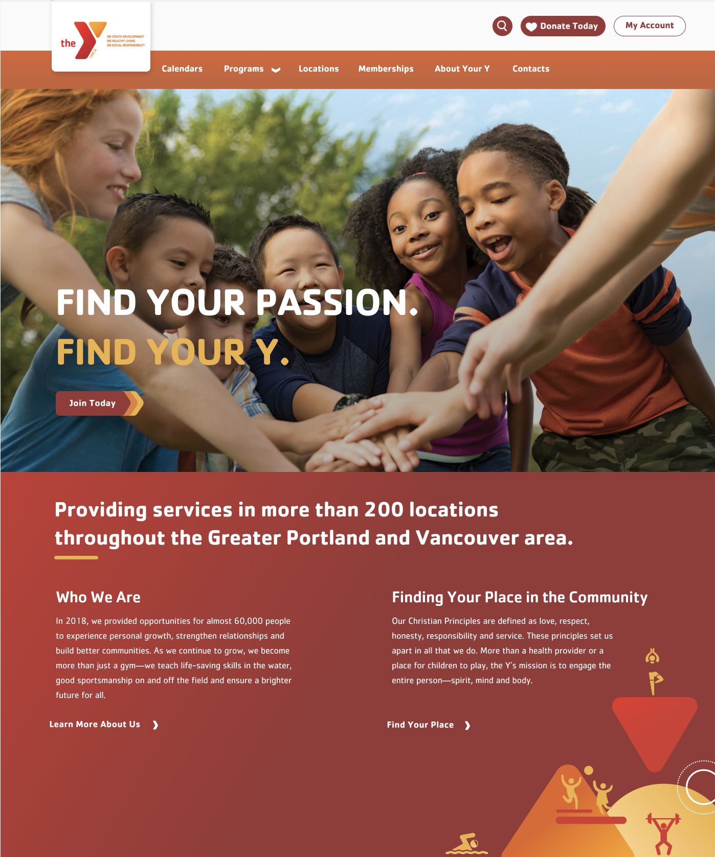
The newly launched site focuses on Schedules, Programs, Facilities, and Membership information. It uses select YMCA branding, rich photographs, and stunning graphics to create a warm and inviting experience for all site visitors and to assist in telling the Y’s story.
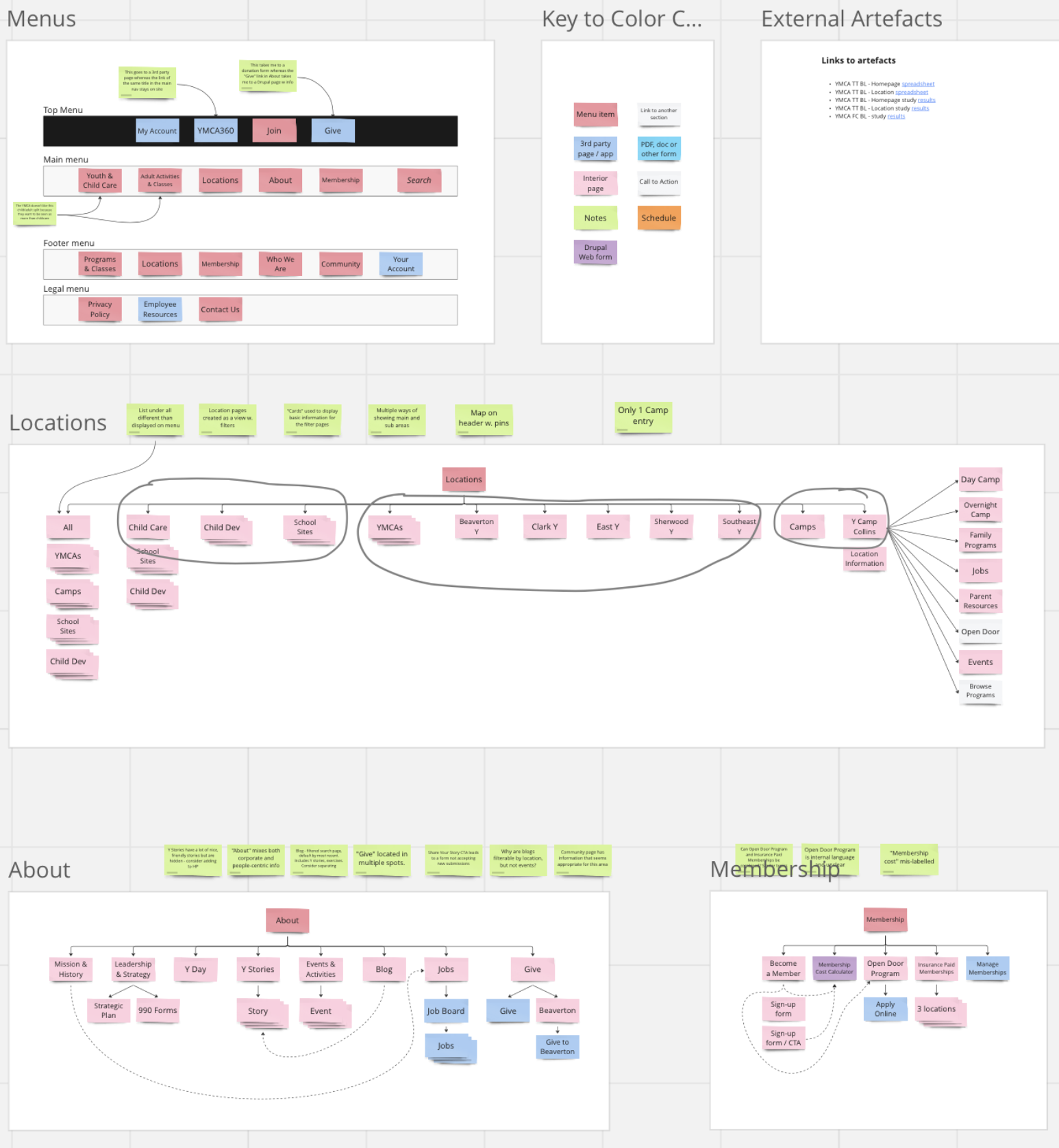
The site uses a focused, intuitive, streamlined, and logical information architecture while leveraging the power of Drupal’s capabilities. The Y’s open-source Drupal distribution, “YMCA Website Services,” formed the basis for this atomic approach to site creation and building, leveraging Drupal Paragraphs and Layout Builder.
Detailed training sessions, a user guide, inline authoring tips, and continued support set the client up for success.
About the Client
Goals
From a branding perspective, the website needed to convey the warmth and community associated with the Y. The previous version of the Y’s website had become a repository of loosely curated information that needed more governance and a maze of paths leading site visitors to, at times, unclear information. This new version needed to streamline and solve the content and site visitor confusion.
From a technology perspective, the site needed to leverage the developing and proprietary “YMCA Website Services” Drupal distribution. The Brooks Digital team also needed to alleviate the Y’s fears of using Drupal. They were intimidated by the platform, believing it was not user-friendly and hard to use.
Methodology
- Messaging analysis and recommendations
- User research and testing
- Content mapping, analysis and recommendations
- Wireframing
- Visual and interface design
- Custom website development and programming
- Site building
- Documentation, training, and adding inline authoring aids to the authoring environment
- Quality Assurance
- Post-launch support and continuous improvement
- Continuous YMCA Website Services distribution learning, contributions and adaptation
Solution
Our user experience workshops and discovery phase uncovered the need to address three primary user types:
- Parents looking for programs for their children
- Individuals interested in fun and rewarding activities
- Seniors 65+ having problems connecting with others and finding suitable information for them quickly and easily
Read more
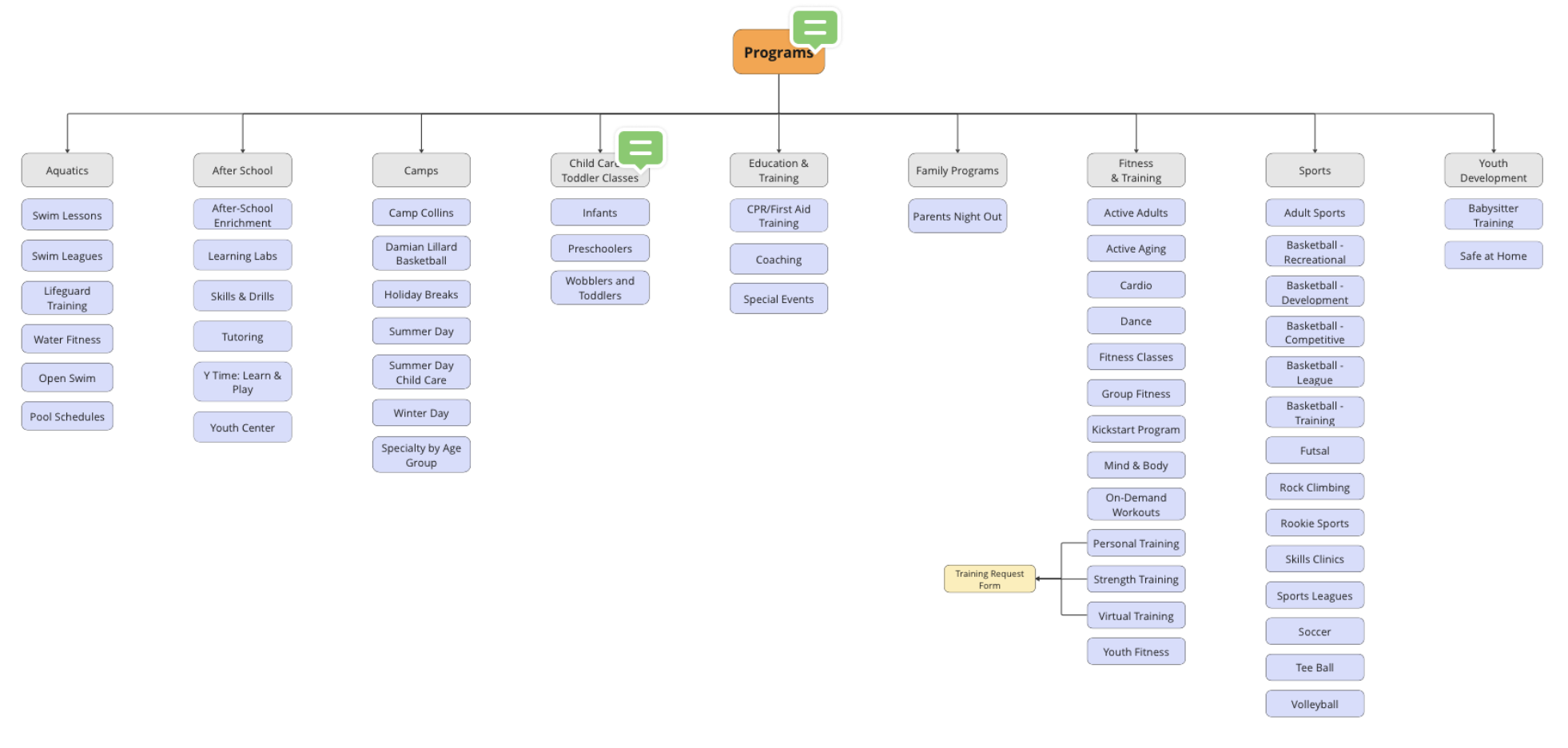
The site uses a focused, intuitive, streamlined, and logical information architecture. Content falls into five main areas of interest:
- Calendars
- Program categories (Aquatics, Adult Sports, After School, Camps, Child Care, Fitness & Training, Youth Sports)
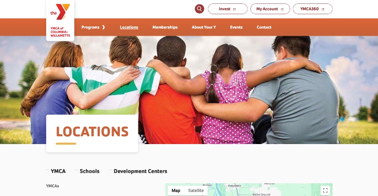
- Facilities (branches, schools, and child development centers)
- Membership information
- YMCA information
The visual design uses select YMCA branding, rich photographs, and stunning graphics to create a warm and inviting experience for all visitors. Inclusivity and the core values of this Christian-based organization inform the design direction.
From a technology perspective, “YMCA Website Services,” the Y’s open-source Drupal distribution, forms the basis of this atomic approach to site creation and building, leveraging both Drupal Paragraphs and Layout Builder. (Our developers needed to understand the distribution and how to build out the underpinnings of the site to work with the distribution, content, and design direction).
Before site building, we provided detailed training and inline authoring tips to assist administrators and set them up for success when building and editing the site. The extensive User Guide begins by discussing Drupal basics and specific terminology. It provides step-by-step detailed instructions for editing and building content throughout the site based on different user profiles. During the final site build, we worked collaboratively with the Y, fine-tuning layouts, editing information, and helping to build out pages needed to launch the website with its minimal viable content.
Design
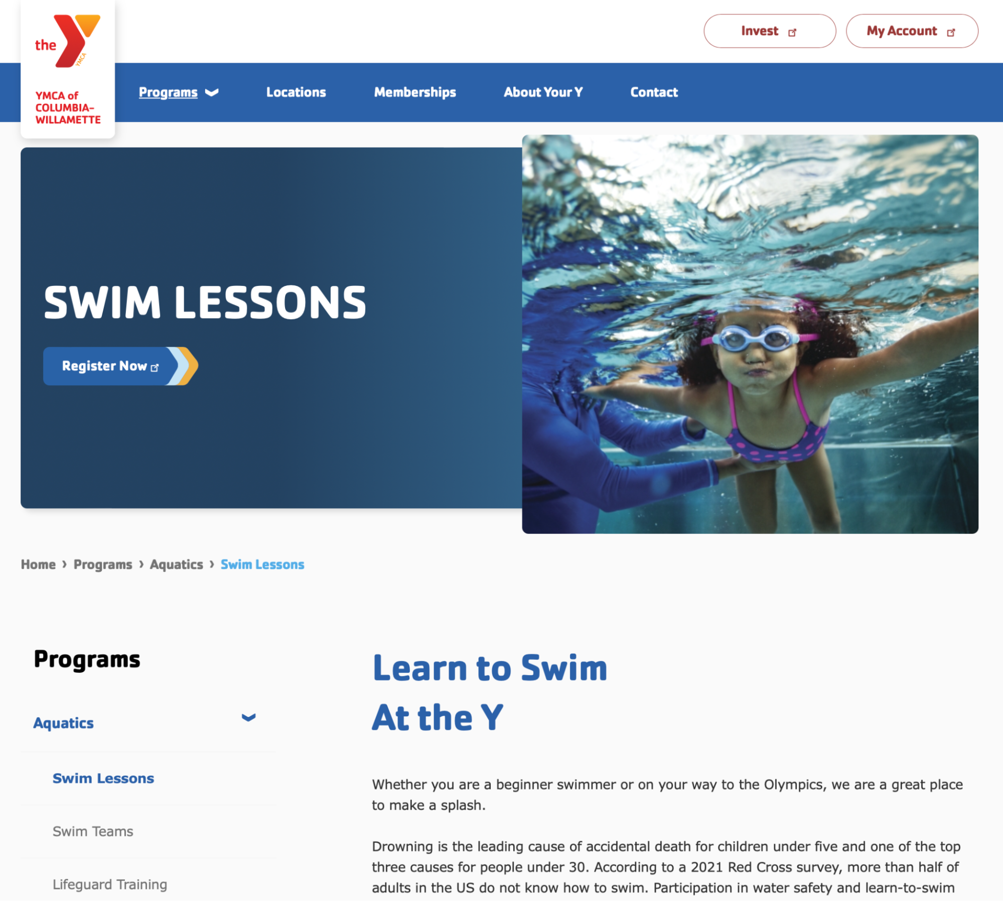
All pages use warm and inclusive images from the Y’s photo library, utilizing rounded corners.
Read more
Page layouts reflect their purpose and functions, use standard components to provide a consistent experience to site visitors, and generously include Member Stories to ensure inclusivity to all.
Challenges
Our developers were unfamiliar with the Drupal “YMCA Website Services” distribution.
Read more
When we began work on this project, two key stakeholders on the client side helped us drive the project forward, answering our questions, making key decisions, and providing approvals. Six weeks before launch, one of the key stakeholders, the Y’s content and technology lead, was replaced with their newly hired marketing lead, giving new perspectives but also requiring knowledge transfer and level-setting within a tight timeframe.
Choosing Brooks Digital for our website project was a super decision for our Y. They clearly had the technical strength, creativity, and flexibility to deliver on a new website but those qualifications were enhanced with thorough, thoughtful communication both in meeting and print format.
Results
With legacy pages and outdated information, the relaunch evaluated, streamlined, and improved existing content while identifying future growth opportunities.
The page layouts provide a single place for site visitors to find information about a topic or program. The pages are warm and inclusive, leveraging the spirit of the Y to its fullest advantage through friendly imagery, language, colors, and fonts.
The site architecture has been flattened and streamlined, improving the user experience. Both Drupal Paragraphs and Layout Builder allow site builders to create pages according to their needs and capabilities. An atomic approach to site configuration provides site builders with standard components that easily adapt to page content.
Detailed training and inline authoring tips assist administrators and set them up for success when building and editing the site. The extensive User Guide begins by discussing Drupal basics and specific terminology. It provides step-by-step instructions for editing and creating each content type throughout the site.
Interested in working with us?
Let’s create something impactful together. Reach out to get started.

