Optimize for People, Not for Numbers
Three days ago, I was flipping through my Twitter news feed, reading a few articles of interest.
I happened upon one that seemed fairly innocuous. It was an interview with a prominent marketing head, offering some wisdom on his past success. I clicked to read it.
Things were going well as I scrolled through and nodded along—nothing groundbreaking being revealed, but it was entertaining and thought provoking nonetheless.
Then something happened.
Just as I hit about the halfway mark on the page, I was shown a pop-up message about signing up for a mailing list for the site I was on. That wasn’t too disconcerted. Aside from being a minor inconvenience, I—like most other internet users—am familiar with these kinds of things. It’s usually as simple as clicking “No thanks” or clicking an “X” in the top corner. But this time, it wasn’t.
This particular pop-up was different. It was pushy in a way that made me feel uneasy—like I had done something wrong by trying to close the box.
In the top section, it asked for my email and offered me some kind of deal, a special guide or something. Then, in giant, bold letters, there was a button that said, “Yes, Send Me the Guide.”
But below that, in tiny, nearly-unreadable font, was my way out. In order to close the thing I had to click on a link that said, “No thanks, I know everything.”
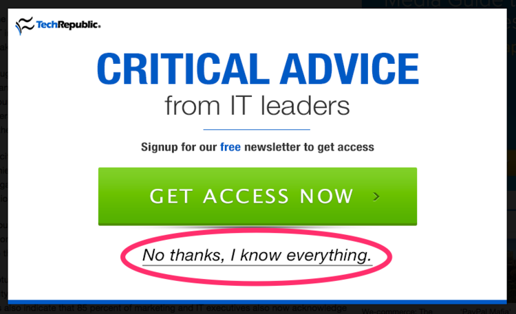
via CruelestOptOuts
Are you making me say I’m a know-it-all? Because I don’t want your “free guide”?
Look, I know this can be chalked up some cheeky marketing attempt. It’s not meant to be taken too seriously. I know that. But I couldn’t help but feel a bit put off by the whole thing. It made me think about what’s behind these kinds of tactics and how we often let the desire for more effective marketing to alienate the people who visit our websites.
What we may gain in conversion rates and click-throughs may be ultimately costing us the values of our brand and the support of our most loyal customers and constituents. And cheap tricks and funny copywriting won’t win that back.
“Hacking” growth
We live in a data-driven world. There are limitless analytics and numbers that give us all a sense of understanding about how and why people do things.
For most of us on the marketing and business side, this manifests itself as website data—traffic, conversions, and click throughs.
We can set up tracking and watch, wistfully, as visitors move from one page on our website to the next. “Did they click the link we were hoping they would?”
All of this power has given rise to a term that’s now thrown around even corporate teams: “Growth hacking.”
To the uninitiated, this term means to take the data that we have on specific actions and users and to methodically and scientifically experiment with ways to impact a user’s behavior—to get more people to do the things we want. To “hack” (engineer) the growth of your company or mailing list or Twitter following or whatever other metric is deemed to be important.
This seems pretty innocuous. It’s just using data in a smart way to improve conversion. Right?
The problems arise when you start to take this strategy to its logical conclusion. What would you do to improve conversion rates? Would you insult the intelligence of your customers to get them to sign up?
This probably seems far-fetched (and maybe a bit delusional). But it’s really not. People have taken this to such extremes that they resort to any number of guilt-inducing, heart-wrenching, or just-plain-shady tactics in order to get people to click a button or pony up an email address.
It’s gone too far.
The underbelly of optimization
As with most things, deciding what’s a “good” marketing tactic and what’s a “bad” one is not a simple matter. There’s no clear distinction, but it’s more of a sliding scale from “Definitely Good” to “Definitely Bad”, and most everything falls somewhere in the middle.
But sites like DarkPatterns.org have been meticulously cataloging and categorizing these overly-aggressive tactics for years.
Here are some from their site and from my own experience:
1. The Insta-Popup
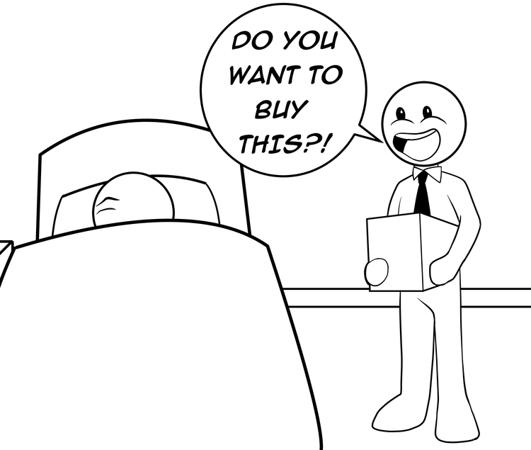
Pop-ups aren’t great, but what’s worse is when a website throws one at you the second the page loads.
I haven’t even had a chance to read anything, let alone decide if the content is valuable enough to warrant signing up to receive more of it—so why ask me to give you my email before I’ve even had a chance to read anything?
2. “Do or Die”
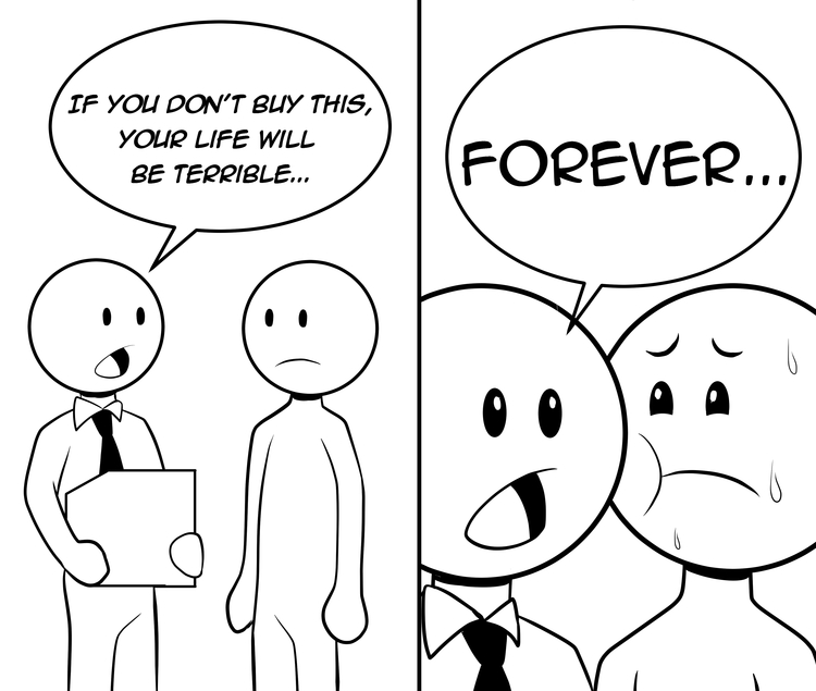
Similar to the example above, one popular tactic in aggressive email list building is to make a user feel stupid, inadequate, or just plain sad for turning down your offer.
This is just slimy—it immediately gives me a negative impression of you and your company. Not only do I not want to give you any information about me, but I want to leave your site and never come back.
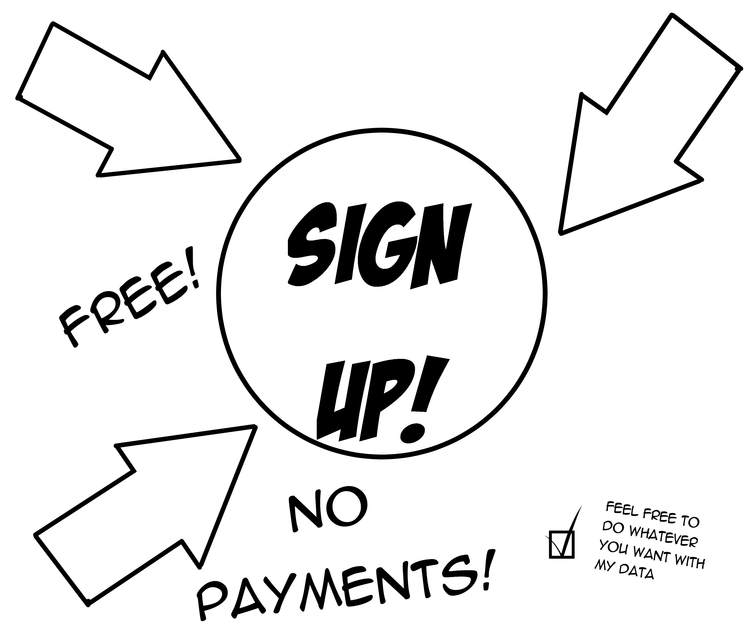
3. Sneaky Opt-In
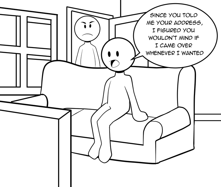
You’ve probably experienced this one a million times. You provide an email address to create an account or make a purchase and viola, you start receiving regular marketing emails that you never agreed to.
Chances are that somewhere in the fine print of the privacy policy, you agreed to this. But that doesn’t make it any better when you’re on the receiving end.
4. Defaulting to Subscription
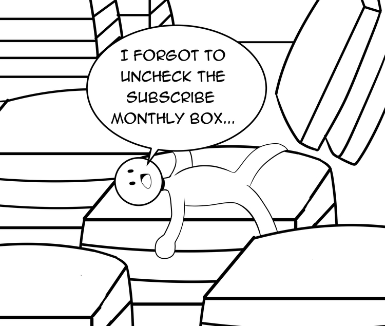
One pretty despicable act that’s carried out by questionable companies is to take someone’s purchase or donation and default it to be subscription.
Think about the old Columbia House model where you’d sign up for some CDs and they wouldn’t stop sending them unless you called to cancel. Or services that offer a “free trial” with a credit card and then automatically start charging you.
5. Misdirection and Visual Sorcery
Have you ever hit “Next” on a screen and found out later that you had been distracted and didn’t realize you opted into or agreed to something you didn’t want? That’s not surprising—too many companies rely on visual design as a way to distract and misdirect users into clicking “Next” or “Okay” on a screen where they’ve automatically checked a box giving them permissions to do X, Y, or Z thing. Like sneaking a checkbox into a random program installation that gives Bing permission to take control of my browser.
It’s a pretty crummy practice, and although it may be technically legal, it’s not very nice to the user. Think of it this way—for whatever advantage you gain in terms of additional users, you’ll take two steps backward in the volume of pissed off people who now have a negative opinion of your organization. Not worth it.
The perils of designing for optimization
I can understand the drive to improve performance at all costs. Edging out an extra 1% response can be huge—it can literally save a company from failure.
But before we take drastic measures, it’s important to remember what our goals really are. We may be attempting to optimize sign-up percentages or conversion rates. But those are just indicators of success. They aren’t the ultimate goal for most organizations.
In our obsession with optimizing for specific metrics, we often miss the bigger picture.
On just the surface level, you have a data issue. When we’re so wholly obsessed with a single metric, we can often miss other data that may indicate a problem.
If you add a pop up asking for people to sign up, you may notice that it increases your sign up rate—say by 10%. This seems like a win, right? But what about the other metrics that are staring you in the face? Did you check to see if it affected the bounce rate? Is it worth gaining an additional 10% in sign ups if 25% more people now immediately leave your page because of the poor experience?
But that’s just the beginning. There’s a much deeper philosophical question to be asked about this optimization approach.
What are we sacrificing for the sake of improving our metrics?
For most organizations, we want to build a sustainable brand that fosters goodwill amongst those we serve. We want people to like us and to pay us money, donate to our cause, or get involved in our mission. We want them to come back. We want them to tell their friends.
If we build such a system that operates simply as a more-efficient extraction mechanism, are we really serving their needs and giving them a good experience?
Or are we just trying to game the system for short-term results—whatever the cost?
It can be easy to justify the means with the ends (especially if you’re an organization that’s doing objectively “good” work.) But it’s not easy to measure the full extent of the impact that these tactics have on our brand and our goodwill among customers and constituents. For every additional email subscription, you may create three people who now have a negative view of your organization. And that’s incredibly difficult to repair.
In building such a system, we are often betraying the very values that we’ve spent so much time, money, and energy forging as the cornerstones of our brand. It’s hard for people to see my brand or organization as trustworthy or righteous if I’m employing questionable tactics to get their money or their email.
How to optimize for humans
Okay, so I’m telling you not to do all of these things that may help boost your numbers and grow your organization. You might be thinking, “so, what, I’m supposed to just not use these tricks and not get better results?”
Well, yes. But that’s not the end of the story.
There are plenty of above-board tactics and strategies that you can take to encourage more users to sign up or opt in or donate or whatever it is that you’re hoping they’ll do—without relying on trickery or preying on our weaker sensibilities.
1. Speak to me as a human
One of the toughest things for many organizations is clearly communicating their brand and their values. But this is so very important. Use every ounce of copy and photography and video on your website to reinforce not just the “stuff” that makes your product or cause good (size, color, shape, quality, number of people helped, etc), but the values and beliefs that are behind it.
As a human, this is what resonates with me. This is what makes me passionate about a brand and want to become deeply involved and connected. This makes me want to purchase, donate, and subscribe.
I could go into a much deeper discussion about the power of branding, but I’ll just leave it at this: Nike never tries to convince you that their products are better, more durable, or less expensive than their competitors. Instead, they focus on aligning their values with yours—and people love them for it.
2. Give me value
Many of the in-your-face pop ups and other tactics are used as a crutch. People use them because not enough people are willingly giving them their email when presented in a normal way.
But why is that? They can just as easily see an opt-in box embedded on a web page. It’s no less obvious to the user what you want them to do.
The question is, have you provided the user with a really compelling reason to receive more information from you? This could take the form of simply having great—really, truly outstanding—content that people want to see and read regularly. Or it could be a specific offer, like a guide or experience.
Surely there are websites where you have read an article and thought to yourself, “Wow, I need to read more of this.”
Do that. Create that feeling for people.
Whatever the case, you don’t need to use anything other than a good old-fashioned call to action with a strong offer to attract attention. But the key is offering something of value.
3. Focus on design
Another reason companies use pop-ups and nagging messages is to compensate for poor design.
Some sites are so cluttered and congested that the only way to make a call to action actually stand out is to make it—literally—rise above the rest of the content. But this is just another crutch. What you should focus on instead is improving the design of your website to lead the user toward the ultimate action you want them to take.
Good design isn’t just about making things look pretty or flashy. It’s about creating a usable and functional experience for people.
Getting to great
If you’re wondering about how to go about directing your organization toward these better practices, there are a number of ways to approach it.
As an agency, we work with firms on a variety of projects that help to align these kinds of values and provide the foundation for a great web experience. There are some exercises and activities you can use to bring clarity to your organization and maximize the impact of everything you do.
1. Card sorting
This incredibly simple exercise involves gathering your internal team to sort and categorize different characteristics that define your brand and organization.
It seems simple, but the act of collaboratively aligning everyone’s thoughts and opinions can be incredibly powerful. Is your organization more nostalgic or traditional? Are they visionary or cutting-edge? Making these fine distinctions—and clearly stating which qualities are not a part of your fabric—create a level of clarity that can really empower your brand to speak clearly about its values and its mission.
2. Experience mapping
Someone searches Google for “how to create a wedding playlist” and they happen to land on your website.
If you’ve set up Google Analytics on your site, you can see just about everything about that user—where they’re from, what language they speak, how long they stay, and so on. But how does that person feel? At that very moment, are they happy? Sad? Frustrated? Confused?
Experience mapping is another exercise that helps you develop empathy with defined user personas based what they are doing, seeing, thinking, and feeling at different stages in their lifecycle with your organization.
Going through this kind of exercise will lead to some “aha” moments about where your brand and website can better connect with the people who visit.
3. UX Testing
Want to rethink everything you thought you knew about your website and how people use? Do a round of live UX testing.
Simply put, UX testing is letting people loose on your website with a couple of specific tasks. Ask them to find a certain page or piece of information. Then observe as they go about the process.
You’ll be shocked.
Things you thought were intuitive will be confusing. People will find buttons and links you didn’t know were there.
True UX testing is an eye-opening and insightful experience and can help you identify problems where people are lost or confused. It can help you provide better information and more intuitive controls and design.
There are many ways to improve metrics and the success of your organization. But some of them require you to abandon your values and diminish your user’s experience and perception of your brand to accomplish them.
Other approaches—the good ones—won’t require that sacrifice.
But they will require hard work and smart planning.
In the end, though, these solutions will make your site, brand, and organization better, more authentic, and more human.

Recent Posts
 How to Organize Patient Resources: A Field Guide for Nonprofit Professionals [Part 4]
 7 Tips for Writing Helpful Content for Patients [Part 3]
 SEO Strategies to Boost Patient Resource Traffic [Part 2]
 Creating a Better Patient User Experience for Nonprofit Websites [Part 1]
 Custom Website Subscriptions: The Ant at the Picnic